
►Typography comes from the Greek words (τύπος) typos 'mark, figure' and (γράφω) grapho 'I write'.

Typography is the art and technique of arranging type, type design, and modifying type glyphs. Type glyphs are created and modified using a variety of illustration techniques. The arrangement of type involves the selection of typefaces, point size, line length, leading (line spacing), adjusting the spaces between groups of letters (tracking) and adjusting the space between pairs of letters (kerning).
Typography is performed by typesetters, compositors, typographers, graphic designers, art directors, comic book artists, graffiti artists, and clerical workers. Until the Digital Age, typography was a specialized occupation. Digitization opened up typography to new generations of visual designers and lay users.

Typography is performed by typesetters, compositors, typographers, graphic designers, art directors, comic book artists, graffiti artists, and clerical workers. Until the Digital Age, typography was a specialized occupation. Digitization opened up typography to new generations of visual designers and lay users.

History
Typography traces its origins to the first punches and dies used to make seals and currency in ancient times. The typographical principle, that is the creation of a complete text by reusing identical characters, was first realized in the Phaistos Disc, an enigmatic Minoan print item from Crete, Greece, which dates between 1850 and 1600 BC.It has been put forward that Roman lead pipe inscriptions were created by movable type printing,but this view has been recently dismissed by the German typographer Herbert Brekle.


The essential criterion of type identity was met by medieval print artifacts such as the Latin Pruefening Abbey inscription of 1119 that was created by the same technique as the Phaistos disc. In the northern Italian town of Cividale, there is a Venetian silver retable from ca. 1200, which was printed with individual letter punches. The same printing technique can apparently be found in 10th to 12th century Byzantine staurotheca and lipsanotheca. Individual letter tiles where the words are formed by assembling single letter tiles in the desired order were reasonably widespread in medieval Northern Europe.


Modern movable type, along with the mechanical printing press, was invented in mid-15th century Europe by the German goldsmith Johannes Gutenberg. His type pieces from a lead-based alloy suited printing purposes so well that the alloy is still used today. Gutenberg developed specialized techniques for casting and combining cheap copies of letterpunches in the vast quantities required to print multiple copies of texts; this technical breakthrough became instrumental for the success of the almost instantly starting Printing Revolution.

Typography with movable type was separately invented in 11th-century China. Metal type was first invented in Korea during the Goryeo Dynasty around 1230. Both hand printing systems, however, were only sporadically used and discontinued after the introduction of Western lead type and the printing press.
Text typography
In traditional typography, text is composed to create a readable, coherent, and visually satisfying whole that works invisibly, without the awareness of the reader. Even distribution of typeset material, with a minimum of distractions and anomalies, is aimed at producing clarity and transparency.


Choice of font(s) is the primary aspect of text typography—prose fiction, non-fiction, editorial, educational, religious, scientific, spiritual and commercial writing all have differing characteristics and requirements of appropriate typefaces and fonts. For historic material established text typefaces are frequently chosen according to a scheme of historical genre acquired by a long process of accretion, with considerable overlap between historical periods.
Contemporary books are more likely to be set with state-of-the-art seriffedNicolas Jenson, Francesco Griffo (a punchcutter who created the model for Aldine typefaces), and Claude Garamond.

With their more specialized requirements, newspapers and magazines rely on compact, tightly fitted seriffed text fonts specially designed for the task, which offer maximum flexibility, readability and efficient use of page space. Sans serif text fonts are often used for introductory paragraphs, incidental text and whole short articles.

A current fashion is to pair sans-serif type for headings with a high-performance seriffed font of matching style for the text of an article. "text romans" or "book romans" with design values echoing present-day design arts, which are closely based on traditional models such as those of
Typography is modulated by orthography and linguistics, word structures, word frequencies, morphology, phonetic constructs and linguistic syntax. Typography is also subject to specific cultural conventions. For example, in French it is customary to insert a non-breaking space before a colon (:) or semicolon (;) in a sentence, while in English it is not.
Color
In typography color is the overall density of the ink on the page, determined mainly by the type face and size, the leading, but also by the word spacing and depth of the margins.

Text layout, tone or color of set matter, and the interplay of text with white space of the page and other graphic elements combine to impart a "feel" or "resonance" to the subject matter. With printed media typographers are also concerned with binding margins, paper selection and printing methods.

Text layout, tone or color of set matter, and the interplay of text with white space of the page and other graphic elements combine to impart a "feel" or "resonance" to the subject matter. With printed media typographers are also concerned with binding margins, paper selection and printing methods.
Legibility and Readability
Legibility is primarily the concern of the typeface designer, to ensure that each individual character or glyph is unambiguous and distinguishable from all other characters in the font. Legibility is also in part the concern of the typographer to select a typeface with appropriate clarity of design for the intended use at the intended size. An example of a well-known design, Brush Script, contains a number of illegible letters since many of the characters can be easily misread especially if seen out of textual context.
Readability is primarily the concern of the typographer or information designer. It is the intended result of the complete process of presentation of textual material in order to communicate meaning as unambiguously as possible. A reader should be assisted in navigating around the information with ease, by optimal inter-letter, inter-word and particularly inter-line spacing, coupled with appropriate line length and position on the page, careful editorial “chunking” and choice of the text architecture of titles, folios, and reference links.
Experimental typography
Experimental typography is defined as the unconventional and more artistic approach to setting type. Francis Picabia was a Dada pioneer in the early 20th Century.

David Carson is often associated with this movement, particularly for his work in Ray Gun magazine in the 1990s. His work caused an uproar in the design community due to his abandonment of standards in typesetting practices, layout, and design. Experimental typography places emphasis on communicating emotion, rather than on legibility.

David Carson is often associated with this movement, particularly for his work in Ray Gun magazine in the 1990s. His work caused an uproar in the design community due to his abandonment of standards in typesetting practices, layout, and design. Experimental typography places emphasis on communicating emotion, rather than on legibility.
Display typography
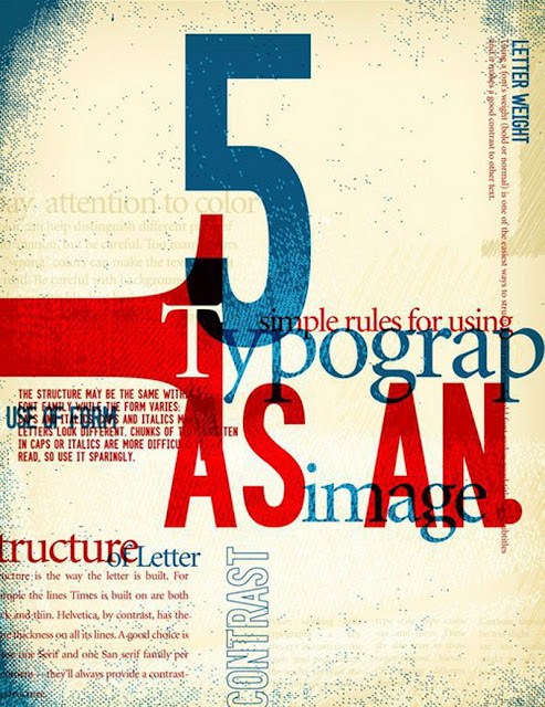
Display typography is a potent element in graphic design, where there is less concern for readability and more potential for using type in an artistic manner. Type is combined with negative space, graphic elements and pictures, forming relationships and dialog between words and images.

Color and size of type elements are much more prevalent than in text typography. Most display typography exploits type at larger sizes, where the details of letter design are magnified. Color is used for its emotional effect in conveying the tone and nature of subject matter.

Color and size of type elements are much more prevalent than in text typography. Most display typography exploits type at larger sizes, where the details of letter design are magnified. Color is used for its emotional effect in conveying the tone and nature of subject matter.
Display typography encompasses:
- posters; book covers;
- typographic logos and wordmarks; billboards;
- packaging and labeling; on-product typography; calligraphy;
- graffiti; inscriptional and architectural lettering;
- poster design and other large scale lettering signage;
- business communications and promotional collateral; advertising;
- wordmarks and typographic logos (logotypes),
- and kinetic typography in motion pictures and television; vending machine displays; online and computer screen displays.
The wanted poster for the assassins of Abraham Lincoln was printed with lead and woodcut type, and incorporates photography.
Advertising
Typography has long been a vital part of promotional material and advertising. Designers often use typography to set a theme and mood in an advertisement; for example using bold, large text to convey a particular message to the reader.

Type is often used to draw attention to a particular advertisement, combined with efficient use of color, shapes and images. Today, typography in advertising often reflects a company's brand. Fonts used in advertisements convey different messages to the reader, classical fonts are for a strong personality, while more modern fonts are for a cleaner, neutral look. Bold fonts are used for making statements and attracting attention.

Type is often used to draw attention to a particular advertisement, combined with efficient use of color, shapes and images. Today, typography in advertising often reflects a company's brand. Fonts used in advertisements convey different messages to the reader, classical fonts are for a strong personality, while more modern fonts are for a cleaner, neutral look. Bold fonts are used for making statements and attracting attention.


No comments:
Post a Comment