►Derek Gores, born 1971, New York. Derek has gained national attention for his collage portrait series, recycling magazines, labels, and found materials to create the works on canvas. The series showcases Gores' contrasting interests in the natural beauty of the figure, the angular design aesthetics of fashion (and machinery), and a fearless sense of play.
A successful commercial designer and illustrator for 15 years, clients include ESPN, Lenny Kravitz, Lucasfilm, Kings of Leon, U2, NASCAR, Adidas, Madonna, Harley Davidson, 321 Agency, Van Halen, the National Football League, LiveNation, SEIU, Love Haight Apparel, and JCPenney.
Derek lives and works in Melbourne, Florida, surrounded by the intellect and culture of the Space Coast.
►Béla Tarr's The Turin Horse follows the story of a carriage driver's family after the death of Friedrich Nietzsche, and the horse that fatefully/indirectly affected their lives.
"In Turin on 3rd January, 1889, Friedrich Nietzsche steps out of the doorway of number six, Via Carlo Albert. Not far from him, the driver of a hansom cab is having trouble with a stubborn horse. Despite all his urging, the horse refuses to move, whereupon the driver loses his patience and takes his whip to it. Nietzsche comes up to the throng and puts an end to the brutal scene, throwing his arms around the horse’s neck, sobbing. His landlord takes him home, he lies motionless and silent for two days on a divan until he mutters the obligatory last words, and lives for another ten years, silent and demented, cared for by his mother and sisters. We do not know what happened to the horse."
These are Béla Tarr’s introductory words at the beginning of his film, which picks up the narrative immediately after these events, and is a meticulous description of the life of the driver of the hansom cab, his daughter and the horse. This Hungarian director’s new work bears all the hallmarks of his inimitable style including long takes, black-and-white photography and almost no dialogue.
►Vanessa Dakinsky is an artist based out of France. Dakinsky creates interesting oil on canvas paintings that comes straight out of her unique art world.
"Through painting lens, I explore undefined spaces, mixing realistic elements with dreamy ones. My work comes from combinations, like an echo between anecdotes of everyday life, my obsessive taste for pictures and a more general curiosity for contemporary mythologies and life. Each painting is a living place for contradictory elements. I avoid to simplify or reduce, and prefer opening the enigmae, shady scenes, their reverberations."
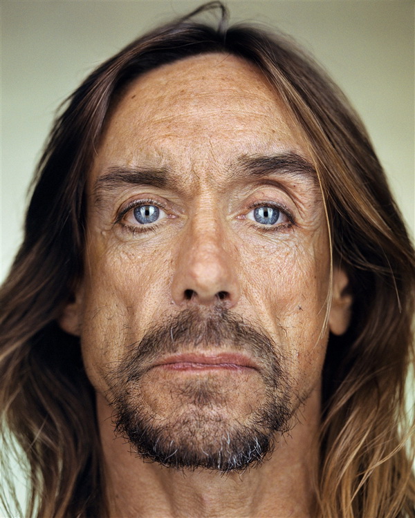
►Martin Schoeller is a New York based photographer whose style is distinguished by similar treatment of all subjects whether they are celebrities or unknown. His most recognizable work are his portraits, shot with similar lighting, backdrop, and tone. His work appears in The New Yorker, Outside Magazine, Entertainment Weekly, Rolling Stone, GQ, Esquire, and Vogue. Born in Munich Germany on March 12, 1968. Married to Helen Rutman Schoeller, a graphic designer, in 2000.
Schoeller studied photography at Lette Verein in Berlin. He came to New York in 1993 and worked as an assistant for Annie Leibovitz from 1993 to 1996. He left in 1996 to pursue his freelancing career. Schoeller has been a contributing photographer to New Yorker since 1999. A book of his portraits was published by teNeues in 2005: "Close Up: Portraits 1998-2005". Another, "Female Bodybuilders," was published by Pond Press in 2008. Stern published a portfolio of his work, "Fotographie Portfolio #54", also in 2008. Schoeller's influences include photographers August Sander, Bernd Becher, and Hilla Becher. His work is in the Permanent Collection of the Smithsonian National Portrait Gallery.
Martin Schoeller’s unique and distinctive style of making portraits is characterized by its directness. The model, often a celebrity, political figure, faces the photographer squarely, and the image is cropped very tightly. It is as if the already forceful essence and intensity of their personality has been further compressed. This power is emphasized in the large format prints (printed up to 50 x 40 inches).
The most vital feature of Schoeller’s work is the mesmerizing way in which the subjects transfix the viewer. The eyes are full of life. The artist’s technique is a combination of his directorial skills and remarkable lighting. The work has been sometimes characterized as raw and unforgiving, but it is, in fact, revealing and smart.
Martin Schoeller has been a contract photographer for The New Yorker since 1999. The editor, David Remnick, says in his introduction to Close Up: " Celebrity is all about surface and saturation, and “the big heads” of Martin Schoeller push those qualities to the limit. They give the face, the human expression, a new dimension, and that’s why we keep looking at them. That’s what portraits are for, what they are all about. It is very hard not to look at long time at these faces, known and unknown, celebrities and ordinary people."
American Photo named him one of the “100 Most Important People in Photography” and in the last year alone, he has been profiled on television and in over 100 international publications ranging from Hello, to The Economist,to Photo District News. A native of Germany, Mr. Schoeller lives and works in New York City.
►Amsterdam-based graphic designer Irma Boom specializes in book making who has different work methods and a different view on things such as the use of unfamiliar materials and formats, colors, structures, and typography. Boom applies the sense of touch into all of her book and has established an international reputation, according to an interview in April 2001.To her, books are seen as objects that communicate ideas and stories and speak to all human senses.
Boom has worked on her 2136 page SHV Think Book as editor and designer for five years. Research for this book took place in cities like Amsterdam, Paris, London, and Vienna. This anniversary book was one of her biggest works and showed a specific view on the history of her company. It was designed to be distributed around the world. However, it's pace of distribution is very slow. Boom has calculated that it will take five hundred years to spread to all the places in the world. Four thousand copies were printed in English and five hundred in Chinese.Her think book has become an international icon of Dutch design.
Her design for ‘Weaving as Metaphor’ by the American artist Sheila Hicks was awarded 'The Most Beautiful Book in the World’ at the Leipzig Book Fair. Her books have been shown at numerous international exhibitions and are also represented in the collections of the Museum of Modern Art in New York.
This Dutch designer has introduced the idea of a "fat book." When Boom was asked what would make her create a book that was two inches tall and half as thick, she replied: “The book is small because whenever I make a book, I start by making a tiny one. Usually I make five, six or seven for each book, as filters for my ideas and to help me to see the structure clearly. I have hundreds of those small books and am so fond of them. I’ve always wanted to make one for publication, but no one has ever wanted to do it. And I thought, well, this time, I can.” The book contains 704 pages and 450 images. She titles the book "Irma Boom: Biography in Books." The New York Times wrote an article called "A Small Book in a Big Career," published on August 8, 2010, based on Irma Boom. This book only ran for about two months at the University of Amsterdam Library. It was bound in a bright red cover with the word "BOOM" printed on the front in clumsy white letters.
Graphic designer Irma Boom has made over 250 books, 50 of which are in the permanent collection of the Museum of Modern Art in New York. Boom, at age 49, has designed most of her books for other people the way she has wanted and felt like they should be. Almost none of her clients have complained. A book designer normally works with texts and images selected by editors and art directors. However, Boom combines the three roles by deciding on the book's structure and choosing the themes and visual material on her own. When working on a book, she obsesses over every element. This includes not only how the book will look, but how it will feel and smell and invents ingenious ways of achieving her desired affects. This is what makes her such a great designer.
Boom designed a book titled "Beautiful Ugly" by Sarah Nuttall. Nuttall states that "the book was designed in Amsterdam by Irma Boom, and I thank her for her extraordinary eye and prodigious talent for making books beautiful."The cover to this book was an olive-green color with no pictures or text. It was simple yet elegant, just like Irma herself.
Dreaming it & doing it...
An artist on a mission to discover, explore, create, love and inspire an artful life.
I strongly believe in creative thinking and feel that design can be fanatic often and complicated which on the other side keeps the basis for creative experiments. I know that I always desire more than I accomplish at the moment, but the art is never ending story,…abounded unfortunately yes…
If you could read my mind, what a wonderful tale my thoughts would tell ...